Bringing Accessibility to Special Olympics of Texas
The Problem
The Special Olympics of Texas website is inaccessible, inconsistent, and redundant with 80% of users experiencing an issues with the website’s current navigation, and a low Accessibility Score of leaving the organization vulnerable to litigation.
The Solution
Improve local participation by removing barriers to inclusion and expanding reach through accessibility best practices.
Users averaged an 86.5% success rate when completing tasks.
New design achieved an AAA accessibility compliance rating.
The Impact
Discovery
Design Failures
18.5%
of the website lacks sufficient contrast between background and foreground colors.
0%
readable font sizes.
33.3%
of forms don’t have associated submission buttons.
Assistive Technology Failures
86%
Of images/objects do not provide alt. text.
80%
of form fields are improperly labled
58%
Links to new tabs/windows aren’t described.
Competitor Analysis
Pros:
Simple and organized navigation tools.
Cons:
Non-readable font sizes.
Pros:
Hover element - users are visually able to see where they are.
Cons:
Lacks contrast between background videos and text overlay.
Pros:
Large text, icons, and buttons.
Cons:
Lacks text hierarchy - variation in text sizes may be confusing to user.
Proto-Persona
Meet Josh!
Josh Allen (20) needs community service hours to be competitive for his graduate school application at UT Austin.
He wants a clearer understanding of the path to becoming a volunteer for SOTX and wishes the website was more accessible.
User Research
Interviews
1 Stakeholder
5 Interviewees
User Insights
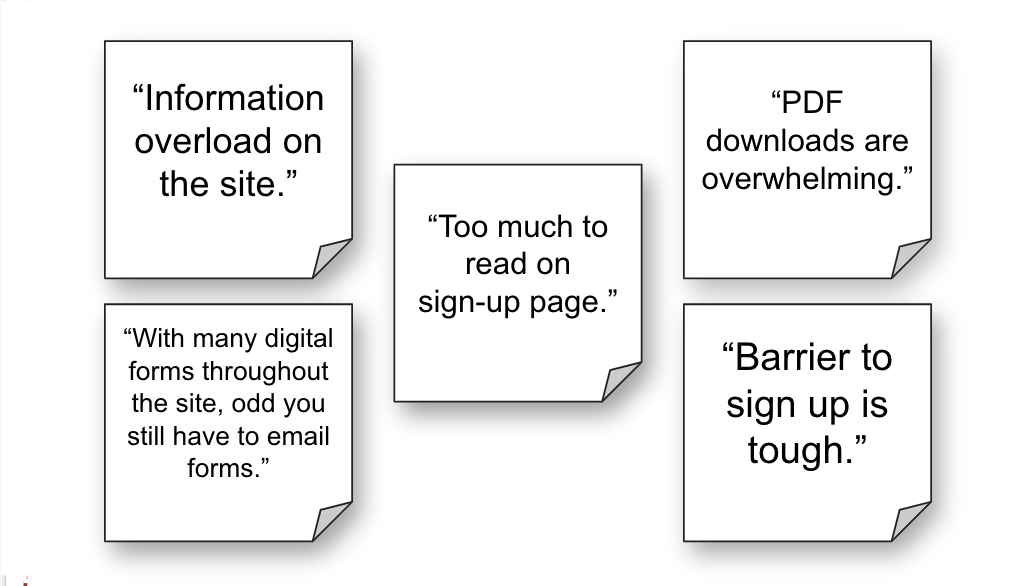
80%
had an issue with navigation.
Ideation& Definition
User Persona
Meet Richard!
“I like to be involved in my community and am actively looking for a way to make an impact.”
Richard is a social worker living in Austin, TX. Richard believes everyone deserves to reach their full potential and wants to be active in helping others do so.
Behavior
Extroverted, spending most of his time outside of work with friends and family.
Frequently looks for ways to be an active member in his community.
Enjoys playing sports with people in his local neighborhood.
Finds pleasure in volunteering and helping others.
Goals
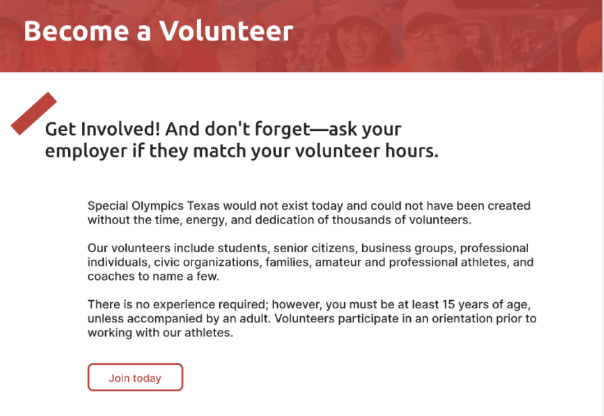
Find flexible volunteering roles.
Get involved with a nonprofit that is meaningful to him.
Unnecessarily complicated registration process.
Inability to see the upcoming opportunities at a glance.
Pain Points
Storyboard
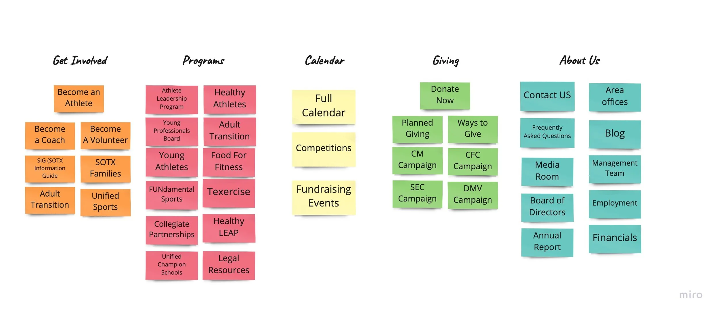
Card Sorting
Volunteer Registration Flow
Information Architecture
UI Style Guide
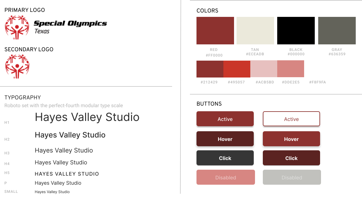
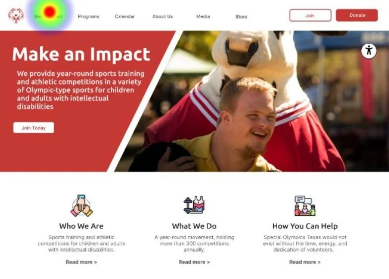
To fit the diverse needs of the SOTX users, we focused on creating higher contrast colors throughout the website. We centered our color scheme around the national organization’s traditional red but preferred a darker red to meet accessibility standards.
Prototyping & User Testing
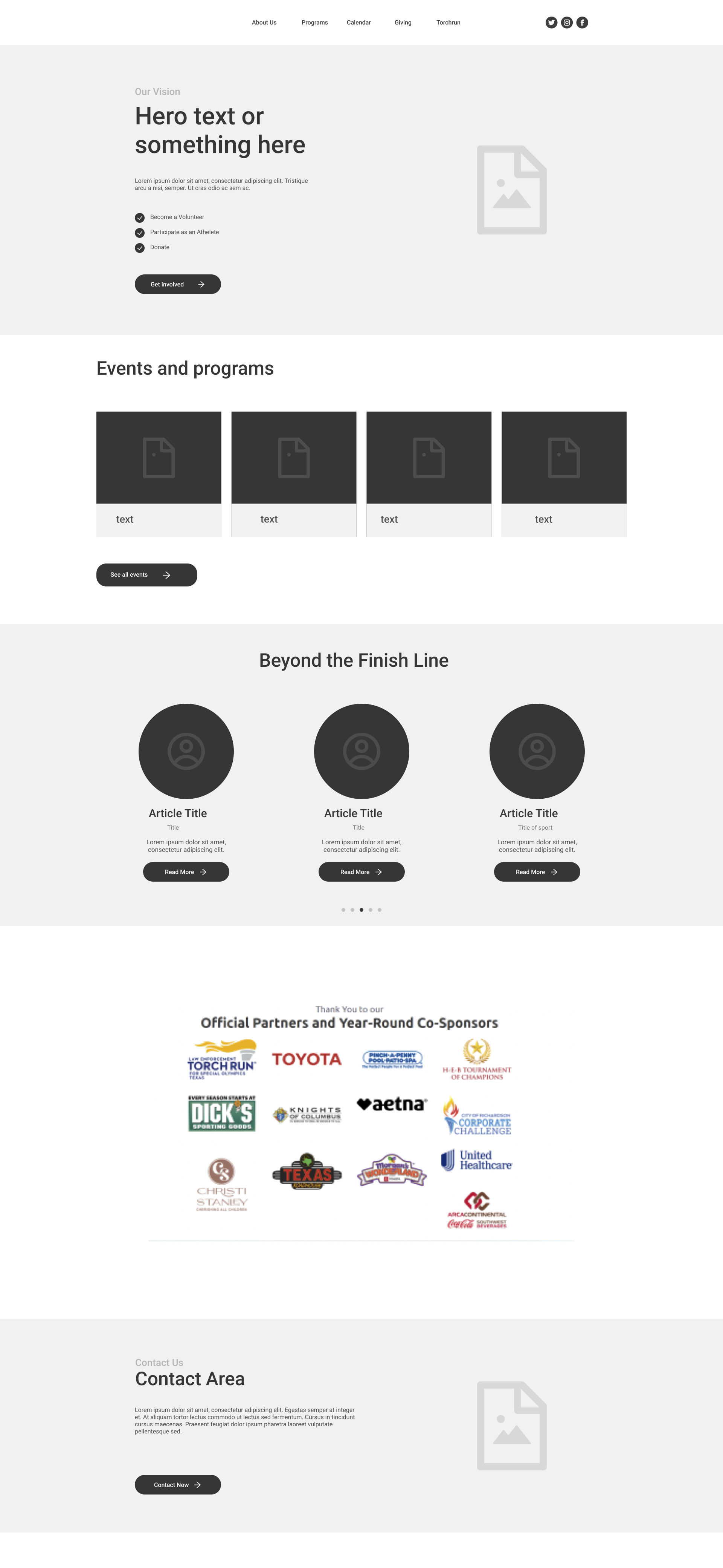
Low Fidelity
User Testing
88.9%
Successfully registered as a volunteer.
85.7%
Successfully found events to register for.
71.4%
Successfully found the mission statement
Feature Prioritization Matrix
Testing Errors and Insights
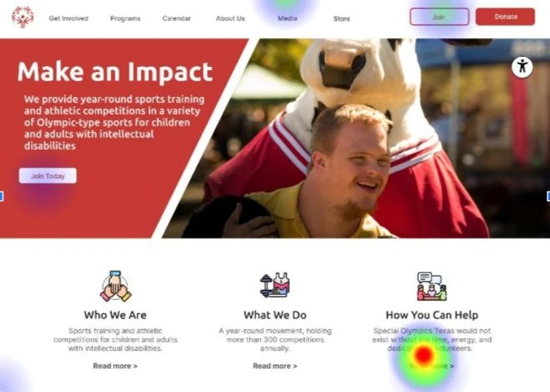
Users didn’t recognize the “Join” button to equate to volunteering.
No reported issues with the navigation or design of the volunteer registration.
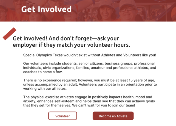
Users didn’t expect the calendar to have volunteer events, with many looking in “Get Involved.”
Final Iterations
Becoming AAA Compliant
While the colors met AA criteria, the contrast between the current Red (background) and White (font) colors were not AAA compliant.
Meeting AAA standards would ensure our design will be accessible to all, not just most.
Increasing contrast by making the red a darker shade.
All forms have Associated Buttons.
Clear action buttons.
Next Steps
Add the ability for users to create an account to increase retention.
Add the option for recurring donations to boost recurring revenue.
Expand accessibility tool options to meet cutting edge accessibility standards.


